Monday, November 21, 2011

The 5 selected photos from season shoot

Narrowing down from the whole shoot was pretty hard, as usual.
Below are the 5 I chose to present to the class:

Most people thought this was a pudding - I don't blame them, it looks like it!
I chose to keep quiet to hear all the guesses and only reveal what the subject matters actually were, and my season, at the very end.
I'm not going to repeat the mystery now, though.
This is a heart-shaped ice cube with a dark food colouring mixed in it.


This is the one that looks gruesome/yummy/festive to me.
It's also an ice-cube, melting away with a blob of red paint in the middle and glitter.


I also added sea salt to some of the water on the tray, and you can see it on this picture.


Ice and glitter, looking festive.


And this was by far everyone's favourite. It's the pattern left on the plate from the melted dark blue ice, after I poured it down the sink.


Despite one suggestion, I wouldn't crop this image as I don't think it would have the same impact as the whole.

I was very pleased to hear everyone confidently answering "Winter" without hesitation when I asked which season people thought this represented, and that made me think I accomplished the brief.

The whole of this exercise made us realise the, sometimes unconscious, impact colour has on images and how they make us feel.

The colours on this shoot were picked deliberately (Dark blue and Silver-> Winter; Red and Green-> Christmas) and I think this element greatly contributed to the success of the outcome.


Season Brief

[I hate Blogger. I hate Blogger. I hate Blogger. I hate Blogger.
I've been trying to upload these contact sheets for hooooours, and it kept failing! Urgh!
I'll so give Wordpress a go for my next modules! *Rant over*]

Our next Professional Frameworks brief was to do with seasons. The class was divided into 3 groups, and each group was given a season (summer not being one of them).
Given we're in Autumn, both Winter and Spring thought they had a much harder challenge in front of them, but to be honest I liked not having Autumn as my season because it made me think harder of ways to express the season instead of just going out and shooting whatever is there.

As much as I like the suspense, my season was Winter. I decided to experiment with ice using a (you guessed it) Macro lens.

I went out and bought some "ingredients" for my fun shoot: ice trays, food colouring, glitter and oil paint.
The results are as follows:


I really like how some of the photos look rather gruesome. Others, yummy.
I wish glitter was edible.
In fact I got quite carried away with all the glitter (maybe working for Swarovski made sparkly things grow on me).

I added squirty cream to the mix thinking of its similarity to snow.

Just as interesting as the ice, was the "left over". The ink of the melted ice created some interesting visuals, especially after pouring it down the sink, leaving some fascinating patterns on the plate.

We had to show five photos to the class in a feedback session, and on my next post I'll show the ones I chose.

Thursday, October 20, 2011

Selected ones

Hello again!

Well, well... so here are those promised photos:

Word: Abstract

1/1600 sec at f/2.8 ISO 100 50mm
Lightroom: Contrast: +7; Vibrance: +8


Word: Imaginative
(it looks like a rubber duck to me =)

1/1600 sec at f/2.8 ISO 100 50mm
Lightroom: Exposure: +0.10; Contrast: +7; Vibrance: +21


Colour: Parlour Rose (inside shell); Word: Rural
(I actually wanted to name it either "campestral" or "bucolic", but I was persuaded to use an easier word for broader understanding)

1/640 sec at f/2.8 ISO 100 50mm
Lightroom: Exposure: +0.15; Contrast: +15; Vibrance: +17


I just liked this egg white drop... its solid shape and reflections. Very 3 dimensional.

1/200 sec at f/2.8 ISO 100 50mm
Lightroom: Contrast: +40; Vibrance: +10


Call me weird, but I found this composition rather romantic!

1/500 sec at f/2.8 ISO 100 50mm
Lightroom: Blacks: +16; Contrast: -8; Clarity: +11


I liked the composition on this one. The photo was taken from inside the bowl...

1/1250 sec at f/2.8 ISO 100 50mm
Lightroom: Exposure: +1.05; Contrast: +11; Vibrance: +17


I like my narrow focuses.

1/320 sec at f/2.8 ISO 100 50mm
Lightroom: Clarity: +22; Vibrance: +15


Both: 1/500 sec at f/2.8 ISO 100 50mm
Lightroom: Vibrance: +39 (left); +42 (right)


Olive oil bottle

1/640 sec at f/2.8 ISO 100 50mm
Lightroom: Exposure: +0.45; Blacks: +2; Contrast: +1; Clarity: +5; Vibrance: +26


Colour: Felbrigg White; Word: Texture

1/320 sec at f/2.8 ISO 400 50mm
Lightroom: Contrast: +16; Vibrance: +33


Colour: Formby Point (leaves); Word: Natural
(Lawrence said this could be potentially used on Christmas cards)

1/400 sec at f/2.8 ISO 200 50mm
Lightroom: Blacks: +7; Contrast: +7; Clarity: +15; Vibrance: +13


1/640 sec at f/2.8 ISO 200 50mm
Lightroom: Clarity: +58; Vibrance: +38


I like the contrast between the flowers and their colours

1/500 sec at f/2.8 ISO 200 50mm
Lightroom: Blacks: +2; Contrast: -14; Clarity: +20; Vibrance: +21


Word: Contrast
(between "flower" and concrete - though unfortunately it's nearer a weed than a flower)

1/200 sec at f/2.8 ISO 200 50mm
Lightroom: Blacks: +10; Clarity: +100; Vibrance: +40


1/250 sec at f/2.8 ISO 100 50mm
Lightroom: Exposure: +0.20; Blacks: +2; Brightness: +3; Contrast: +5; Vibrance: +15


I really like this one

1/320 sec at f/2.8 ISO 200 50mm
Lightroom: Contrast: +8; Vibrance: +28


Word: Vibrant

1/640 sec at f/2.8 ISO 200 50mm
Lightroom: Contrast: +3;


Can you see the stars?

1/640 sec at f/2.8 ISO 200 50mm
Lightroom: Brightness: +5; Contrast: +4;Vibrance: +16


I'm not generally drawn to pictures without a sharp focus, but somehow I think it works on this one. It's very soft.

1/1000 sec at f/2.8 ISO 200 50mm
Lightroom: Contrast: +15;


Fairy Wings

1/1000 sec at f/2.8 ISO 200 50mm
Lightroom: Contrast: +11; Vibrance: +7


Word: Shape
I really like this one

1/320 sec at f/2.8 ISO 200 50mm
Lightroom: Contrast: +21; Vibrance: +33


I just love this flower! It's so unusual! And kinda "fluffy" :)

1/1600 sec at f/2.8 ISO 400 50mm
Lightroom: Vibrance: +12


Delicate

1/2500 sec at f/2.8 ISO 400 50mm
Lightroom: Vibrance: +20


I was taking this last shot when I was approached by a suspicious neighbour enquiring me "Why I was taking photos of his house!?!?". I found there were many people curious about what I was doing and being very suspicious. It made me quite uncomfortable, to be honest =S
Oh well, I think it was worth it anyway! :)

Wednesday, October 19, 2011

Word/Colour Assignment

Hello there! Welcome to my Professional Frameworks blog!
I intended to share these pictures a good while back, but 1) My computer broke and I was computerless until I sorted the funds to get a new one 2) I have a job and 3) I'm in the middle of moving house. This is actually great, because my commute was 3 hours/day (return) which is pretty insane, especially as it's not like I lived outside of Manchester!

But anyway, better late than never, isn't it? ;)

So... the brief for this assignment was to present a total of 8 images, all relating to a word (one was given to you, the others you picked from a list - my allocated word was contrast) and 3 of these had also to relate to a colour from a colour swatch you also received randomly.
My colour swatch was composed of the following colours: Felbrigg White (light beige), Strangford (slightly darker beige - still pretty light, though), Parlour Rose (pinkish beige), Bow Room (grey), Ham House (kind of brown) and Formby Point (purply brown).

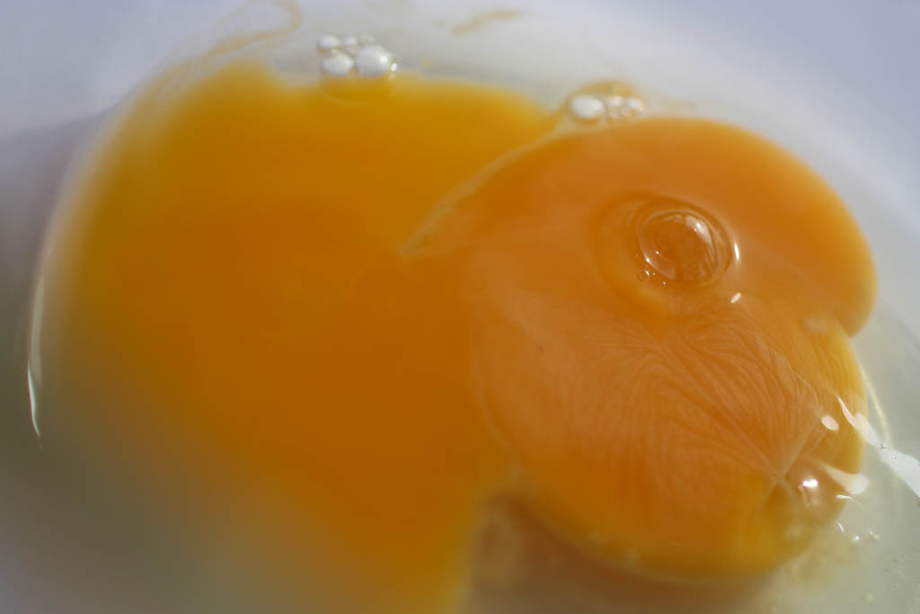
Looking at the light beiges made me instantly think of egg shells. Then this idea started to excite me and I decided to borrow a macro lens from Uni to experiment with the subject.

It was disappointing to realise the egg shell wasn't quite the colour I imagined, but gladly the inside part was! Phew! =D

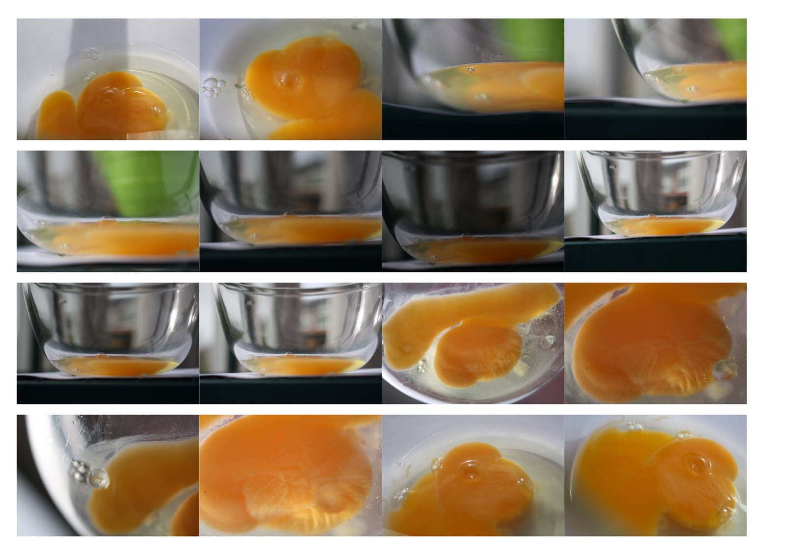
Below are some contact sheets of all the pictures I took for this assignment (all unedited).
As I did with my first post on my other blog (www.photoskillsa-ana-cunha.blogspot.com), I'll select my favourites from these, edit them and re-post on a bigger size so you can see them properly! ;)


Since I had to break the eggs, I thought I might as well make the most of it - not just the shells!

Need I say I had omelette for lunch? ;)

Then I decided to try shooting this bottle of olive oil with spices I bought on my last trip to Brazil... I wasn't too impressed with the outcome, I must admit.

I tried to shoot the egg as I slowly poured it into the bowl - it's really hard!! Especially when you're trying to hold the egg with one hand and shoot with the other without getting your camera dirty and not being able to make changes cuz you haven't got enough hands!! =S

The colour of this wallpaper also matched one of my given colours, and I decided to link the word texture to it too.
Also, because this was my first time using a macro lens, I wanted to explore it by doing what I can't with my ordinary lens. For this reason you'll be seeing very shallow depth of field on these images!

Time to go outside!

This plant's leaves matched my purpley brown, which is quite a hard one to get!

Snapshots of a few random things with my colours on the way...

Then well, I had a macro lens in hands, there were pretty flowers all around... I just had to!!


This yellow plastic thing had a mosquito lying on it. That's what I was trying to capture - quite hard!!

Then some nice flowers with interesting shapes... The petals on the white one look very much like wings to me!


I love this flower! So unusual!


Well, I'll post again soon with my selection of favourites and "relevant to the brief" ones, and will elaborate further on them ;)

Take care! x